Key points
- Learn more about searching and filtering data in the National Center for Health Statistics Data Query System (DQS).
- This guide provides step-by-step instructions to display, download, and cite estimates from DQS.
Overview
DQS has thousands of statistics for hundreds of health topics. To create your visualization, select the data by going through the following steps.
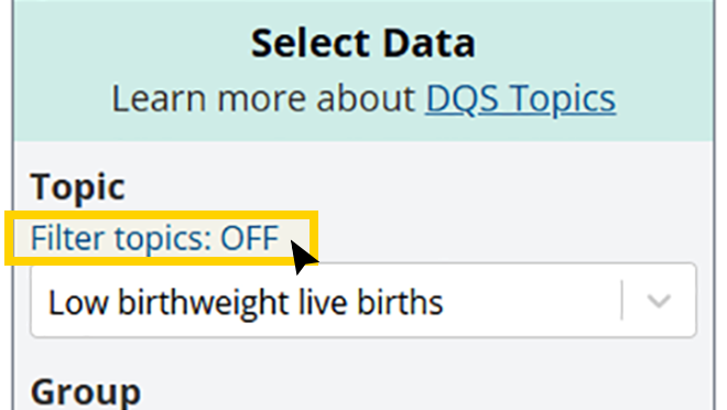
Step 1: Select a topic (required)
Select a health topic using the “Topic” dropdown list.
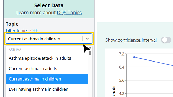
Related topics are grouped together into categories.
Some health topics, such as obesity, have data from more than one source. To learn more about the qualities that distinguish these data, see DQS Health Topics.
To maximize the visualization, the menu can be hidden by clicking the "Hide menu" button. When hidden, the menu can be shown by clicking the "Show menu" button.
Related topics are grouped together into categories.
Step 2: Filter topics (optional)
You can filter the topic list to show only estimates for specific population groups or from specific data sources.
A popup window that allows you to select one or more categories will appear.
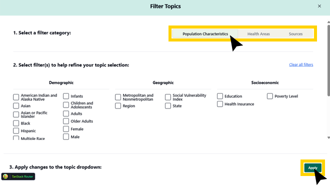
Once you have made your selections, click "Apply." Only topics with available estimates based on the filters you selected will be displayed.
You can click the X in the top right corner of the popup filter window to exit without applying changes.
When using the "Filter topics" feature, the hyperlink will change from "OFF" to "ON."
Step 3: Select a group (optional)
Based on your selection(s) in steps 1 and 2, options will appear in the "Group" dropdown list.
Related groups are organized together into demographic, geographic, socioeconomic, and other characteristics.
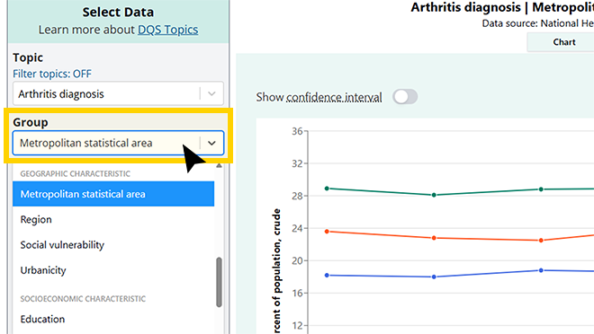
You can scroll through the list of groups or type keywords directly into the group list field.
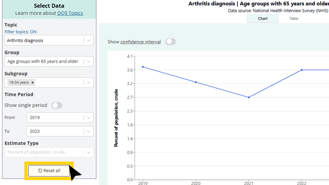
Step 4: Select subgroup(s) (optional)
Based on your selections in steps 1 through 3, options will appear in the "Subgroup" dropdown list.
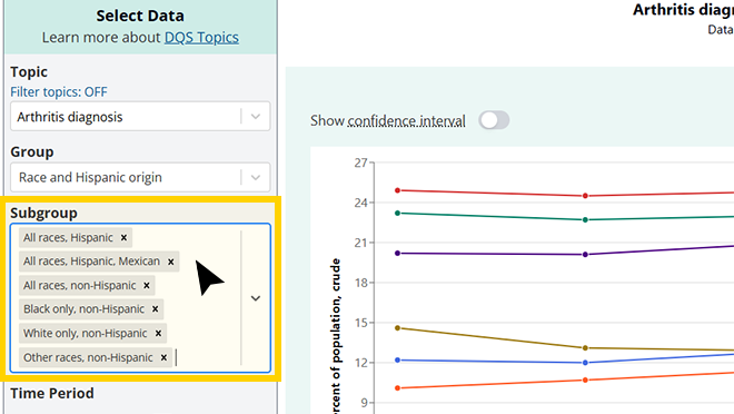
If there are nine or fewer subgroups, then all will show. No more than nine subgroup selections can be made at once.
You can select or deselect subgroups from the subgroup dropdown. You can also type keywords directly into the subgroup list field.
Step 5: Select time period (optional)
Under "Time Period," you may choose to view estimates for a single time period or a range of time periods. If you slide the toggle on for "Show a single period," the chart will be in bar chart format. If you choose a range of time periods with "From" and "To," the chart will be in line chart format.
Note that some topics have individual time periods that are several data years pooled together, such as 2005-2008, rather than single years.
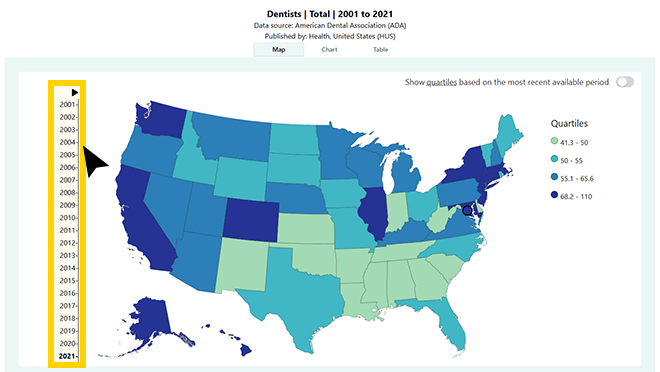
You can click the "Play" symbol at the top of the timeline of years to view all maps presented in order over time.
Step 6: Select estimate type (optional)
Based on your selections in steps 1 through 3, you may have a choice about what type of estimate you visualize in DQS, including rates, counts, crude percentages, age-adjusted percentages, etc.
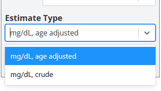
If only one estimate type is available, the dropdown list will be disabled.
Example
If you are interested in estimates on breast cancer by age for the most recent year—
- Select "Breast cancer" in the " Topic" dropdown list (Step 1).
- Then choose from the demographic characteristic options on age shown in "Groups" dropdown list (Step 3).
- In addition to the default selection of the first subgroup, use the subgroup dropdown list to deselect or reselect subgroups for your visualization.
- Toggle on “Show single period” and select the latest data year to display. You will have a choice of chart or table views.
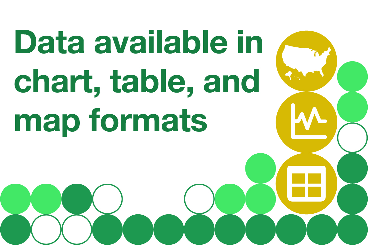
Data visualization
DQS can display estimates in chart, table, or map views.
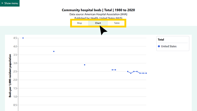
You can change the format by selecting the "Map" or Table" tab. Note that the map format is unavailable for topics that do not have state-level data.
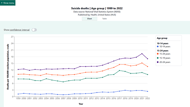
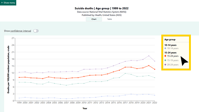
Legend features
The subgroup dropdown list and the legend contain headers to demonstrate where subgroups may fall under other subgroups.
"Show all subgroups" toggle
If there is more than one subgroup for your selected group, there will be a “Show all subgroups” toggle in the table view.
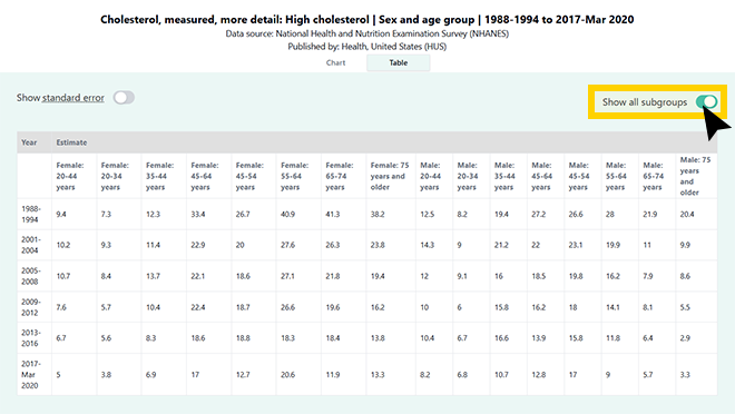
When toggled off, only the subgroups selected in Step 4 are displayed.
You can toggle on all subgroups and switch to chart view to see up to nine subgroups in the chart.
“Show confidence interval” or “Show standard error” toggles
Confidence intervals or standard errors are available for most topics. A confidence interval is a range of values that describes the uncertainty around an estimate. A standard error is a value that describes the variability of an estimate.
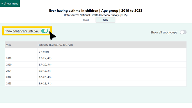
When toggled on, the confidence intervals for the selected estimates are displayed in the table and visualized in the chart. When toggled off, that information can be accessed from the chart view by hovering your cursor over a data point.
If confidence interval data are not available but standard error data are, there will be a toggle in the table view.
Map Features
"Show quartiles based on the most recent available period" toggle
Quartiles are a way of categorizing statistics. Quartiles divide data into four groups.
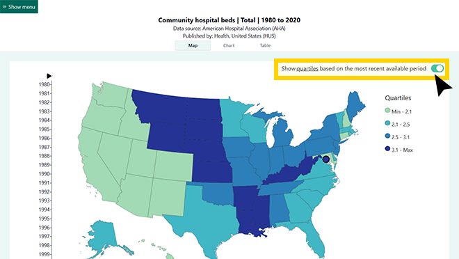
If the toggle is on, the quartiles displayed in the legend are based on data from the latest time period available and remain the same across all time periods. If the toggle is off, the quartiles will change based on the data from the time period you select on the map timeline.
Download options
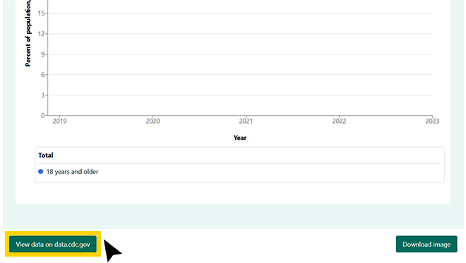
Depending on the view you are in, you can download an image of the chart or map using the "Download image" button.
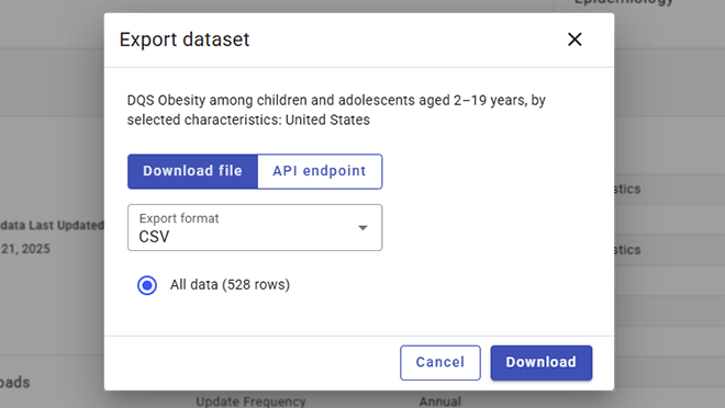
To download a CSV file of data for your selections only, use the "Download data" button in table view.
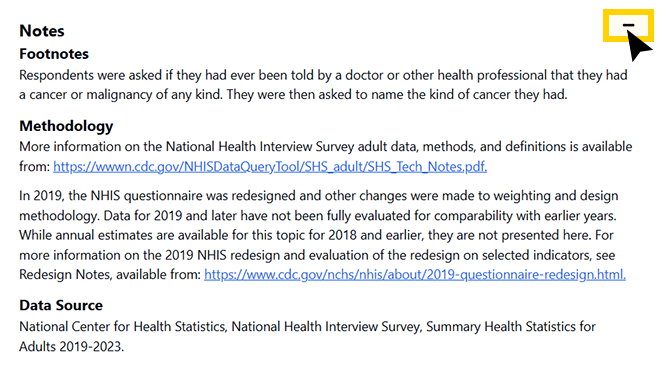
Notes
Notes based on your custom selection will be displayed beneath the data tables, charts, and maps. These may include—
- Data issues: information about the availability or reliability of the data
- Footnotes: more definitions and details about the selected groups and subgroups
- Methodology: information about how the data were collected and analyzed
- Data Source: the organization and survey that collected the data